Logos


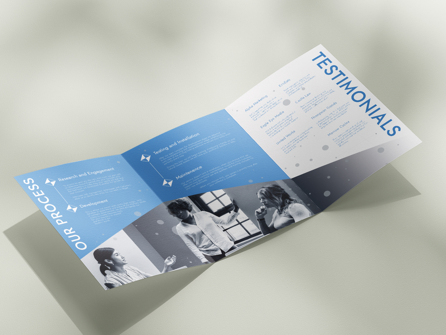


Guisborough Life, a local magazine delving into the history, news, businesses, people, and events of the historic town, underwent a revitalization and rebranding project under our direction. The objective was to elevate the magazine's design to meet contemporary professional standards. This involved crafting a brand new logo, redesigning key elements, creating nine distinctive advertisements for local businesses, as well as ensuring that the layout of each article adhered to industry norms, all while maintaining recognisable elements in order to give the new and old issues a sense of continuity.
In our creative approach, we made the choice to preserve the existing orange and white colour palette and to expand upon it. This expansion encompassed a fresh, modern logo and captivating article headings. By infusing the cover with a vibrant and distinctive appearance, we aimed to captivate customers and leave a lasting impression for future editions.
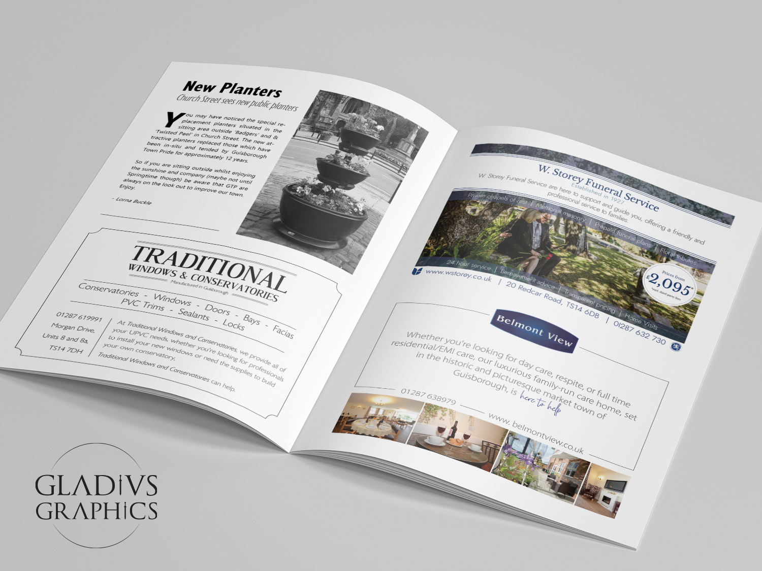
For the back page advertisements, we modernized their design by incorporating sharp, high resolution imagery, appropriate and professional colour schemes, on top of prominently featuring the unique logos and branding of each business. To set them apart, we employed contrasting colour schemes: one advertisement with black text on a white background, and the other with white text on a black background. This distinction visually distinguished the two businesses, granting them both the same level of quality while avoiding confusion with possible customers.


Similarly, the inner advertisements underwent a transformation to meet higher professional standards. We utilized our keen knowledge of visual hierarchy to create a design which employed suitable fonts, effective positioning, clean and high-resolution images, and a judicious application of colour. These enhancements breathed life into the advertisements, creating an inviting and polished ambiance, thereby encouraging more business opportunities.

With the help of Gladius Graphics, Guisborough Life now successfully meets industry standards. The magazine's brand has undergone expansion, captivating a broader readership and enhancing its reputation. Collaborating with this smaller local publication was truly delightful, as it allowed us to provide local businesses with a level of quality that rivals larger competitors. This is a passion of our studio—to empower and elevate local enterprises. Our efforts were highly valued, leading us to be brought on to design and maintain their affiliated social media project "The Guisborough Archive". As long as possible, we intend to maintain our collaboration with Guisborough Life to further cultivate and refine their brand.

The focus of this brief was the creation of an entire brand identity including a logo, menu, advertising sign and other auxiliary designs based around a classic nautically themed British pub and restaurant named "The Frigate Pub and Grill". The key words were "rustic", "traditional" and "vintage".
The logo underwent several iterations, with some versions focusing on text and heraldry decoration, while others featured stylized engravings of a frigate sailing through turbulent seas. Eventually, a compromise was reached, resulting in a stylized half helmsman's wheel framing bold vintage fonts.
Once the logo was finalized, the brand identity began to take shape. A black and white colour palette, along with nautical and vintage elements, formed the basis for the auxiliary designs, ensuring a cohesive visual identity. The selected items for further development were essential elements in the bar and restaurant industry: branded coasters, a standing advertisement, and a menu. These designs incorporated the established greyscale colour palette and logo as a basis while expanding on the nautical and rustic themes.


A rustic wooden plank textured backdrop ordains the menu, playing on the dark colour palette while also referencing a frigate's hull. Vintage elements again appear in the form of framing borders (this time using a classic corner bevel), vintage fonts for the section titles and menu items, and finally some decorative dual lined motifs working to highlight key words. A photograph of the venue is the focus of this design, colour corrected to enhance the natural rich tones of the furniture in order to not only create a warm and inviting atmosphere, but to also create a link between the design and the stand.
This design was kept simple in terms of information, with a prominent logo and special offer is presented. The simplicity allows for a focus on key information which would otherwise be lost. In order to create brand cohesion, a repeating double lined border motif was applied in various ways on each of the three designs, both tying them together thematically and distinguishing them as individual. For this coaster, the border creates an effective framing device for the central logo while also reinforcing the item's shape and invoking the vintage style present throughout the project.
By incorporating recurring motifs and a consistent aesthetic, the overall design of the restaurant was tied together, with each piece serving as an extension and exploration of the logo. However, skilful variations in tone, colour palette, and other motifs allowed each design to stand on its own merits while also standing out as a unique piece.
Gladius Graphics is a full-service graphic design agency specializing in brand identity, logos, print and digital media solutions.
Our collaborative approach ensures that we work closely with our clients throughout the design process, keeping their vision at the forefront and incorporating their valuable feedback every step of the way to develop and deliver designs that combine artistic finesse, technical expertise, and strategic thinking in order to achieve a lasting impact in the digital and print realms.
At Gladius Graphics, we understand that design is not just about aesthetics; it's about effective communication. We believe that every brand has a unique story to tell, and it is our mission to bring those narratives to life through captivating visual experiences that resonate with your target audience, leaving a lasting impression that goes beyond mere visuals.
We pride ourselves on our ability to understand the distinctive essence of each brand and tailor our design solutions accordingly. Whether it's creating eye-catching logos, developing a multi platform advertising campaign, designing sharp business cards, or enhancing brand identity through a series of menus or brochures, we offer a comprehensive suite of services to meet your design needs.
So, whether you're a budding entrepreneur looking to establish your brand identity or an established business aiming to revamp your visual presence, Gladius Graphics is here to help you conquer the design battlefield. Let us harness the power of design to elevate your brand and stand out in a crowded marketplace.
For more information on our pricing and what we can do for your business, fill out the following form and we'll get back to you: